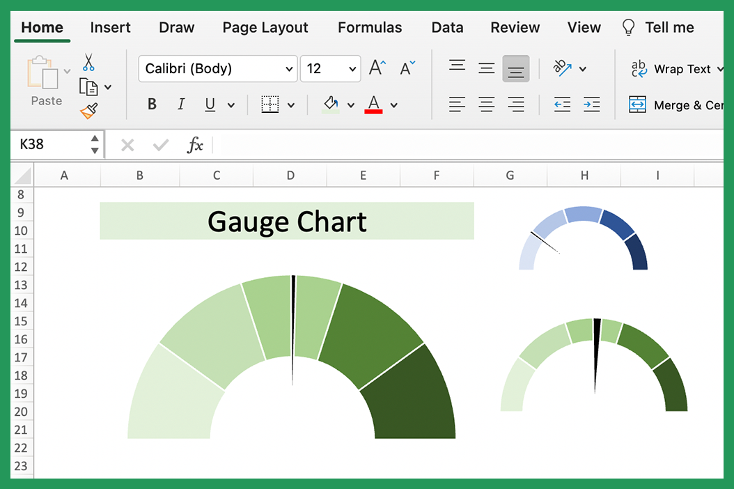
Gauge charts are typically composed of three parts: a dial and a needle. The dial is the background of the chart, and the needle is the part that moves to point to the current value. They are often used in dashboards, as they provide a quick way to visualize a KPIs.
There is a downloadable worksheet at the bottom with the examples on discussed in this article.
Gauge Chart #1
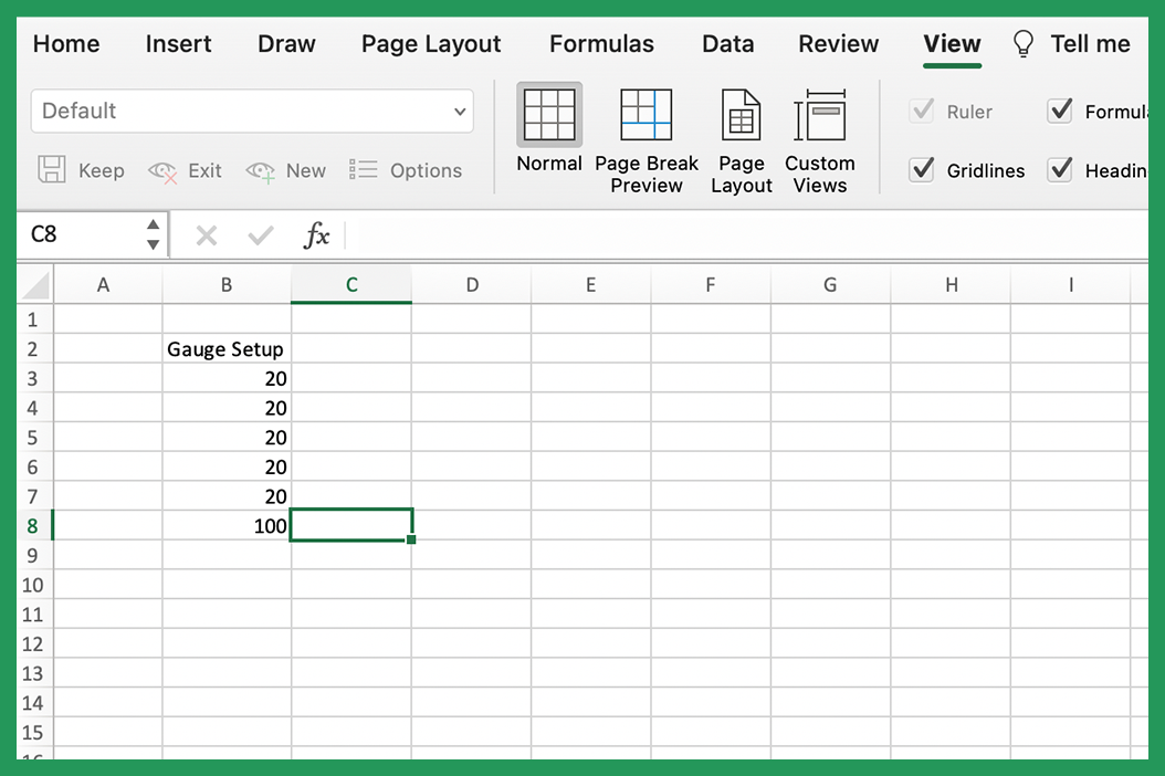
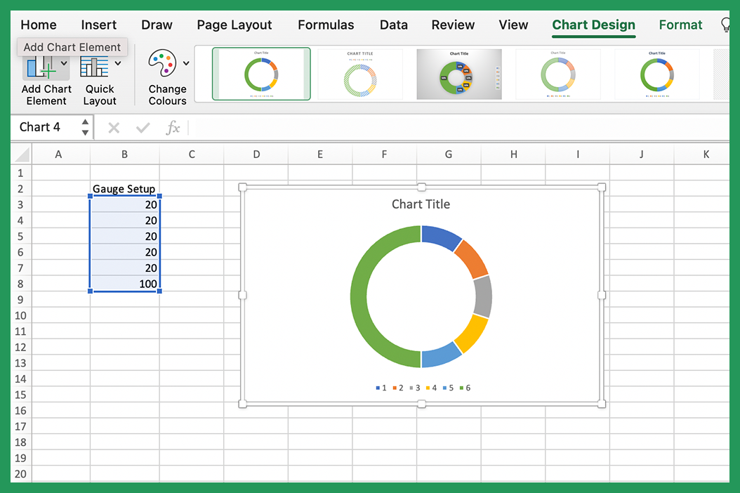
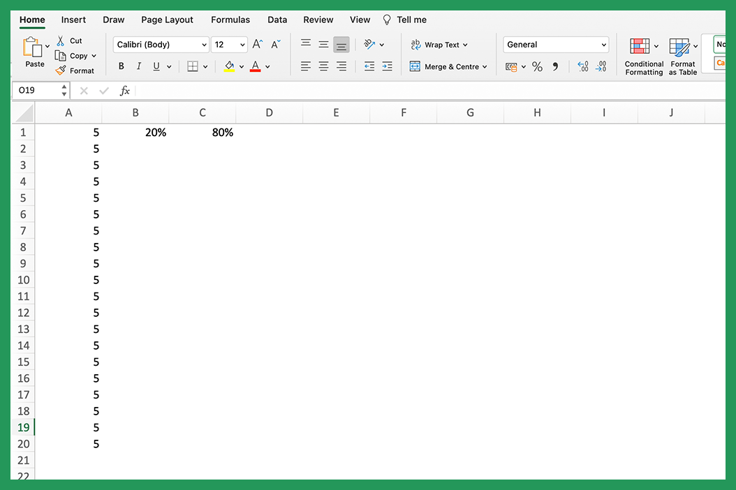
We are going to start with a speedometer style gauge chart. To begin with you are going to need a table that looks like this. this defines the size of the segments we are going to use. In our case we are going to have five equal segments.
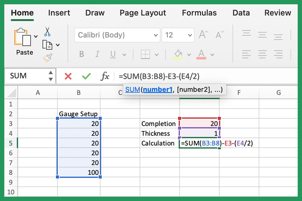
To begin with we need to create a table with 6 values, 5 of which will represent segments of our chart and the sixth will be hidden. Each of the segments are the same thickness so that we create a uniform dial. You can vary the number of segments by reducing the value of each segment. If I wanted 10 segments on this gauge chart I would put 10 10’s instead of 5 20’s, the important thing is that it adds up to 100 in our case.
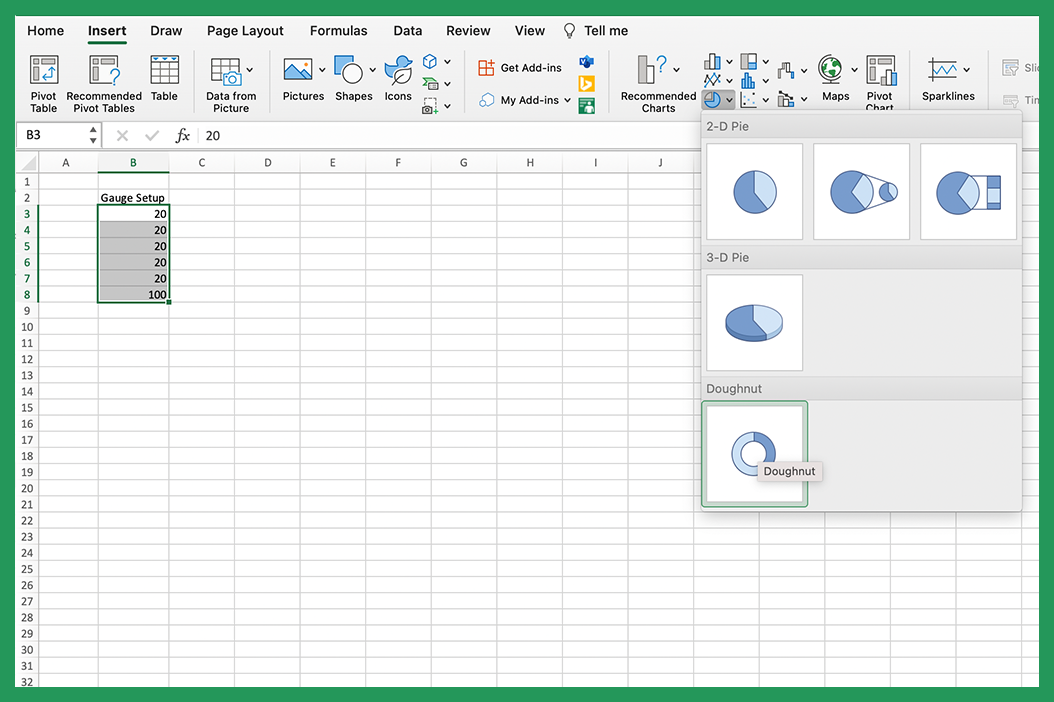
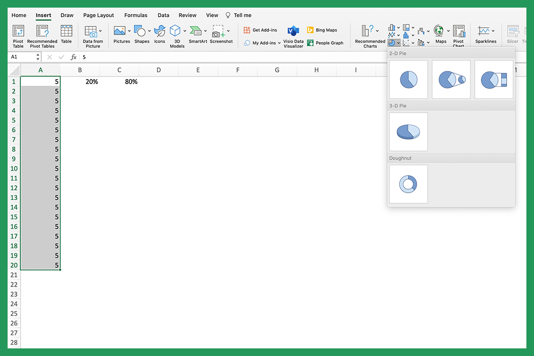
Highlight the data and select the doughnut chart type.
This will create your doughnut chart but we need to make a few adjustments.
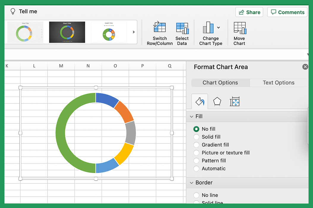
Remove titles and keys but selecting them and pressing delete. The chart background and border can be removed by clicking on the chart and clicking 'No fill' and 'No Line' in the format chart area panel.
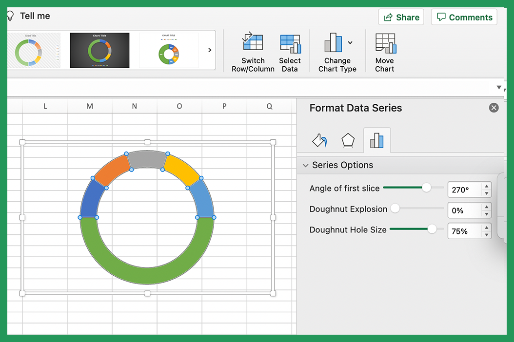
Change the angle of the first slice to 270 degrees by clicking on the doughnut itself and editing it in the format data series panel. You can also edit the doughnut hole size on this step if you would prefer a thicker or thinner gauge.
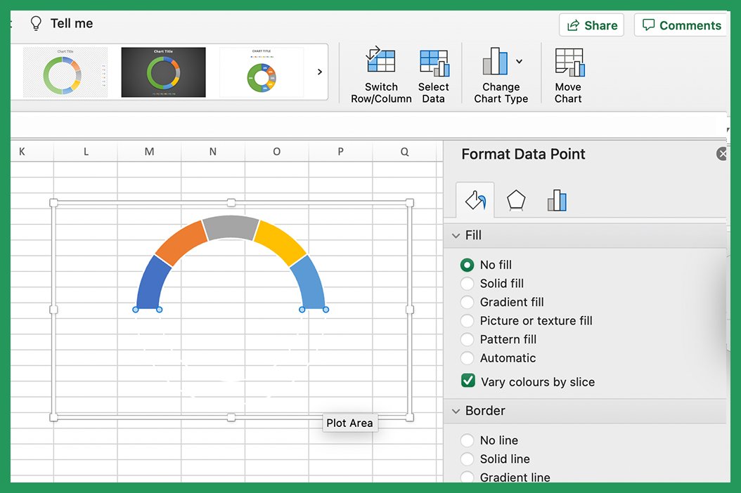
Make the bottom slice no fill so it goes invisible.
Add a color scheme by selecting each slice and adding a color to it. I like to use a single color and vary the grade of that color. Excel has theme colors built in so we can highlight each segment and select a different shade of whatever color we choose.
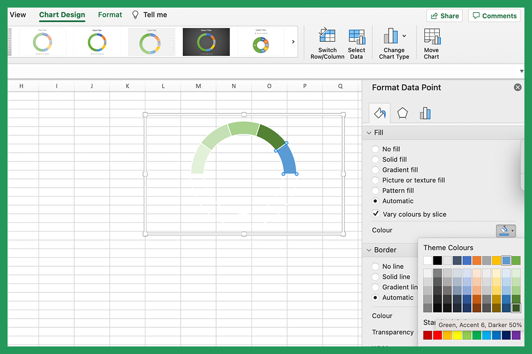
Now we need to add the needle that will show the completion percentage. We are going to do this by overlaying our doughnut chart with a pie chart. We will then create a segment within the pie chart that will act as the needle for our gauge chart. This allows us to change the thickness of the needle to whatever we like and it will be one of the values we can change in our control panel.
First we need to create the data for our pie chart. Our completion percentage is how. The first value controls where we want the needle to sit, the second controls the thickness of the needle and the third is a calculated one based on how far round we want the needle to sit. The formula for this is the sum of the values in the first table minus the completion, minus the thickness divided by two. This ensures the needle sits in the right place.
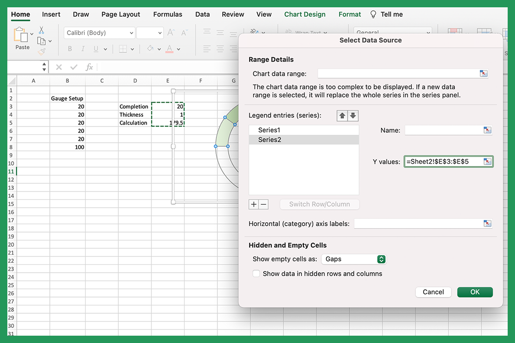
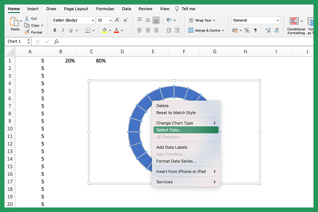
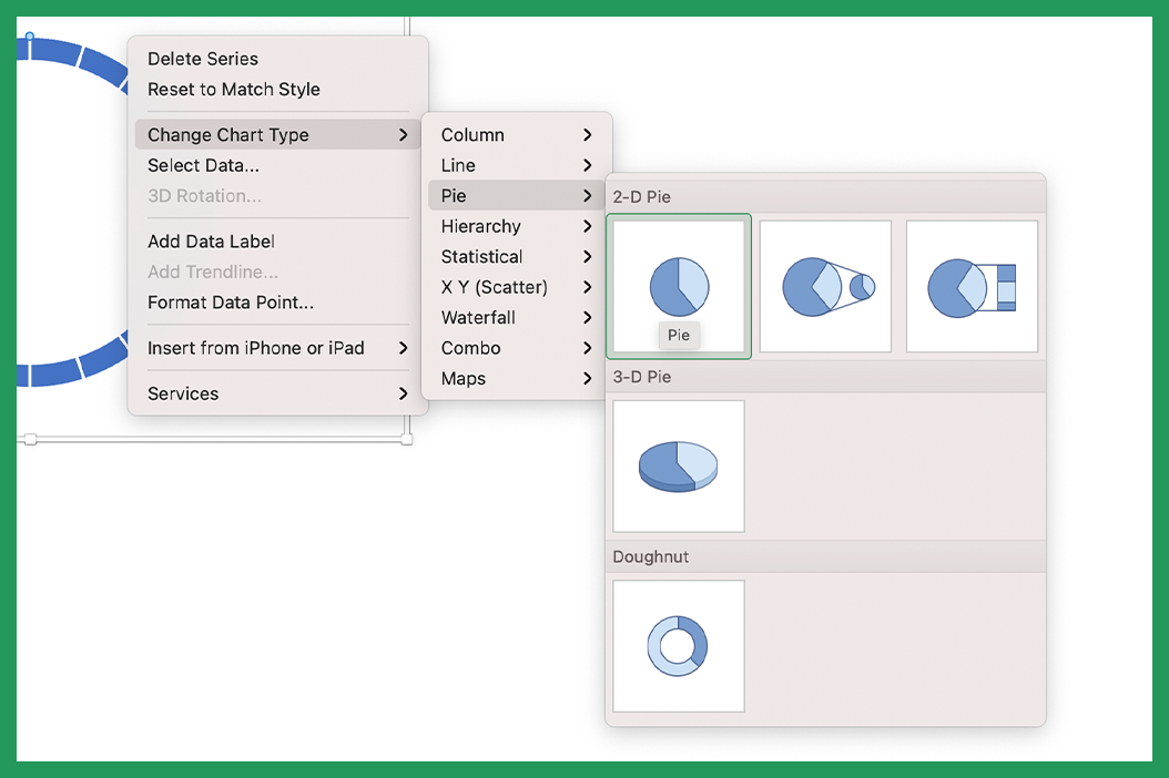
Right click on the chart and click select data.
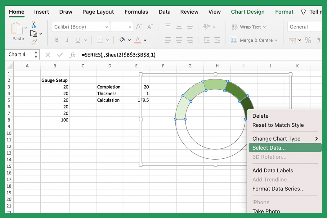
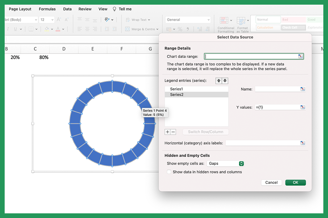
Add a new legend series by pressing the plus icon.
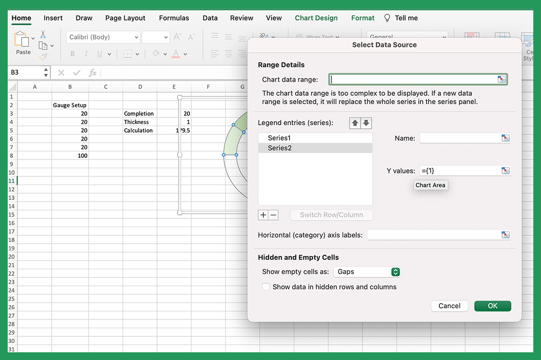
Then highlight the three values.
Change chart type to a pie chart.
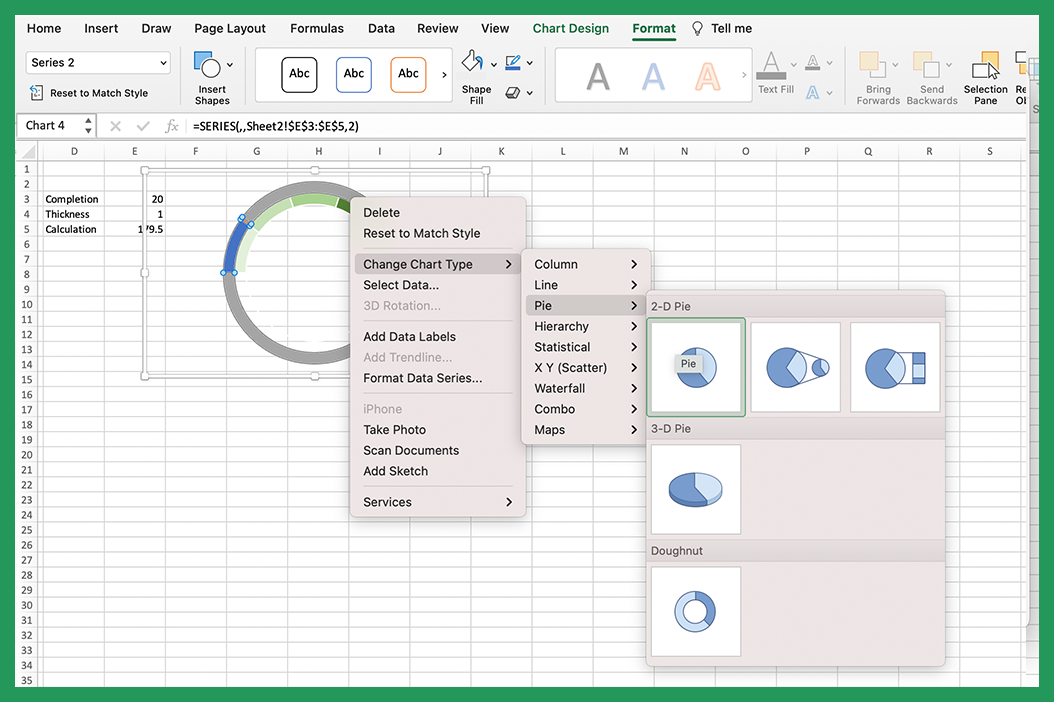
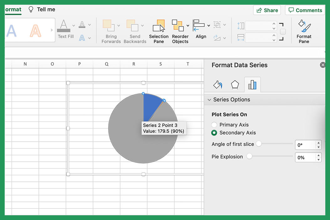
Move the pie chart to the secondary axis by clicking on it and selecting secondary axis in the format data series panel. Adjust the angle of first slice to 270 degrees similarly to the doughnut.
Then remove everything except the needle by highlighting it and selecting no fill.
And that's it! I have added a chart title by merging cells rather than using the built in ones.
Gauge Chart #2
Our second example will be more in the style of a progress chart.
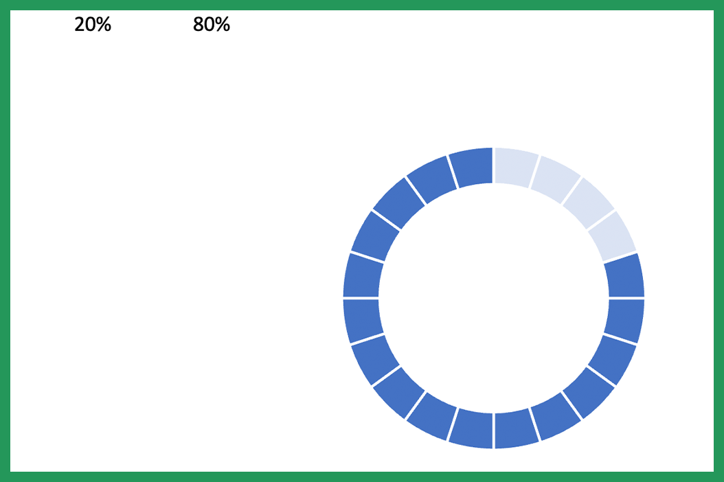
We can set this up by adding the number of segments we want to use. You can use any number to do this but if you want it to be evenly spaced make sure all the segments have the same value. I have chosen 20 segments for this example so each segment represents 5% of the circle but if you want a more detailed chart you can add more segments. For example you could use 2.5 as the value and create 40 segments.
To create our graph highlight the table and select doughnut chart. Remove the border, keys and background again. Then fill all the segments with the same color.
We will then overlay this doughnut chart with a pie chart. Right click on our chart and click on select data.
Click on the plus and then highlight our completion and still to go percentages. We then want to no fill the completion percentage and just keep the still to go percentage.
We will then change the color to white and the transparency to 20%. Right click the chart and click change chart type to pie chart.
There we have it, our second type of Gauge Chart. We’re now going to add titles and formatting to make it look better.
I hope this tutorial was helpful in showing you how to create a simple yet effective gauge chart in Excel. If you have any questions or suggestions, please feel free to leave a comment below.
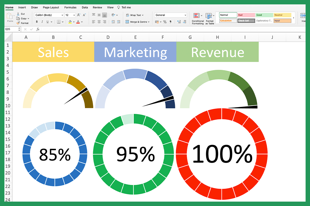
Every time I use these charts people love them and always ask how they were made so it’s worth trying to sneak them into all important dashboards and presentations. Excel has inbuilt functionality to create many charts but for this one we needed to get a little bit creative. The way we create gauge charts is by overlaying a doughnut charts and pie charts where the doughnut represents the dial and the pie chart represents a needle. We also have a control panel so that the chart can be updated when changes are needed. They are great for adding a visual component to dashboards and are a thrill for excel nerds like me!
There are many ways to challenge yourself when creating a gauge chart. For example, you can change the size of the needle, the color of the dial, add data labels, add button control or add a chart title. You can also add thresholds, which will cause the needle to change color when a certain value is reached.