Pie charts are inarguably one of the most popular types of charts used in business and for data analysis. They are easy to read and understand, making them perfect for displaying information that is divided into categories.
This guide will show you how to create pie chart styles in Excel and provide some tips for formatting them for maximum impact. Let's get started!
What is a Pie Chart?
A pie chart is a popular type of graph that shows how different parts (small slices) make up a whole (pie). Pie charts are often used to show how a large group is divided into smaller values and subgroups. For example, you could use a pie chart to show how different age groups make up a city's population.
Creating a Pie Chart in Excel with Insert Tab
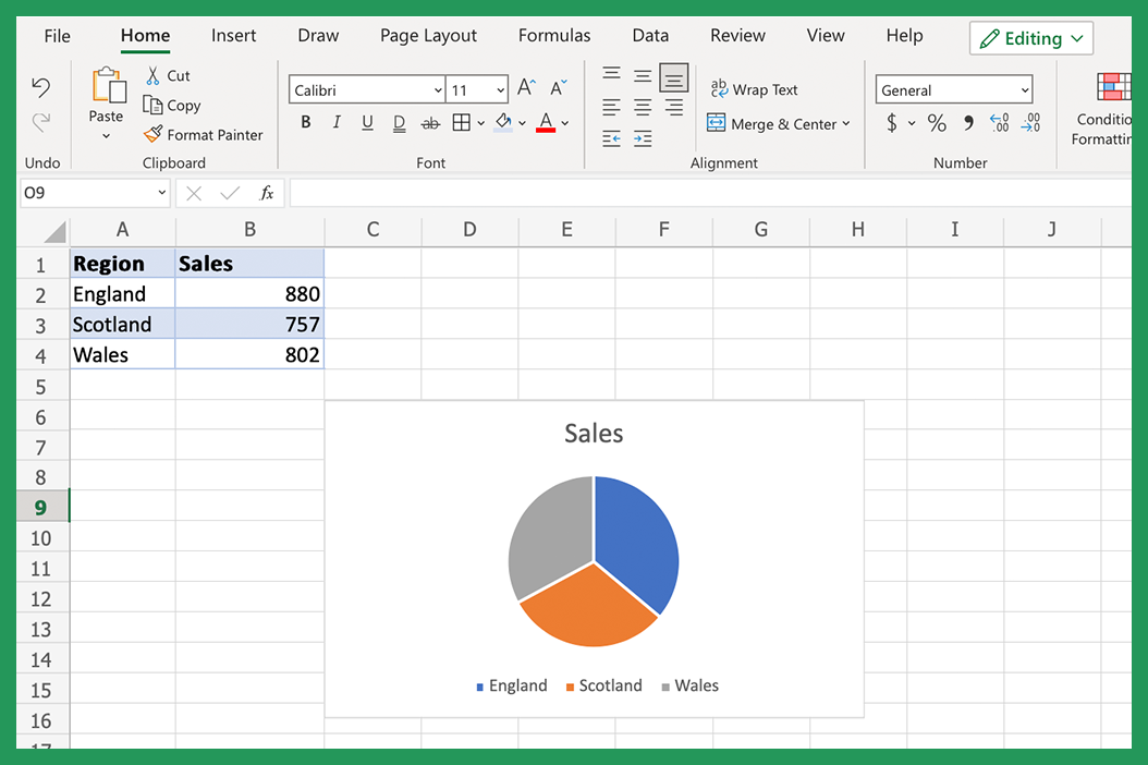
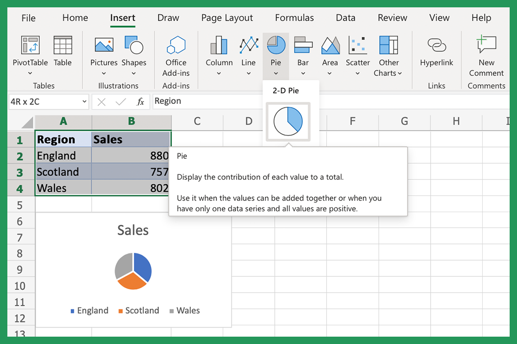
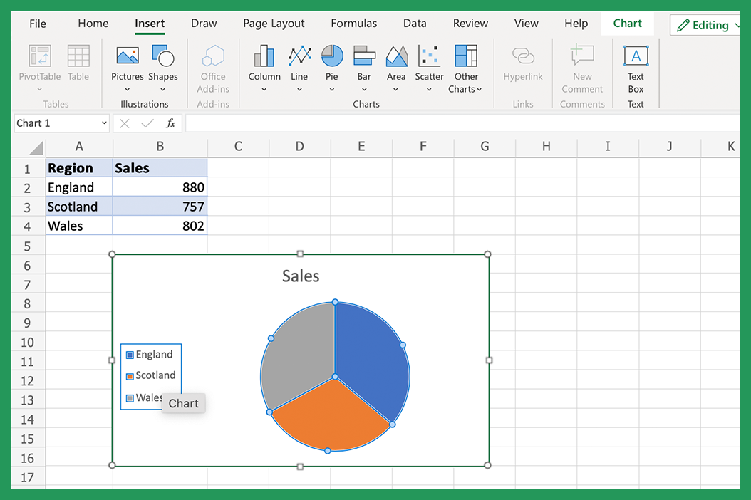
The first step in creating a pie chart is selecting the data you want to use. Pie charts are best used for data that is divided into categories, such as sales by region or market share by product type.
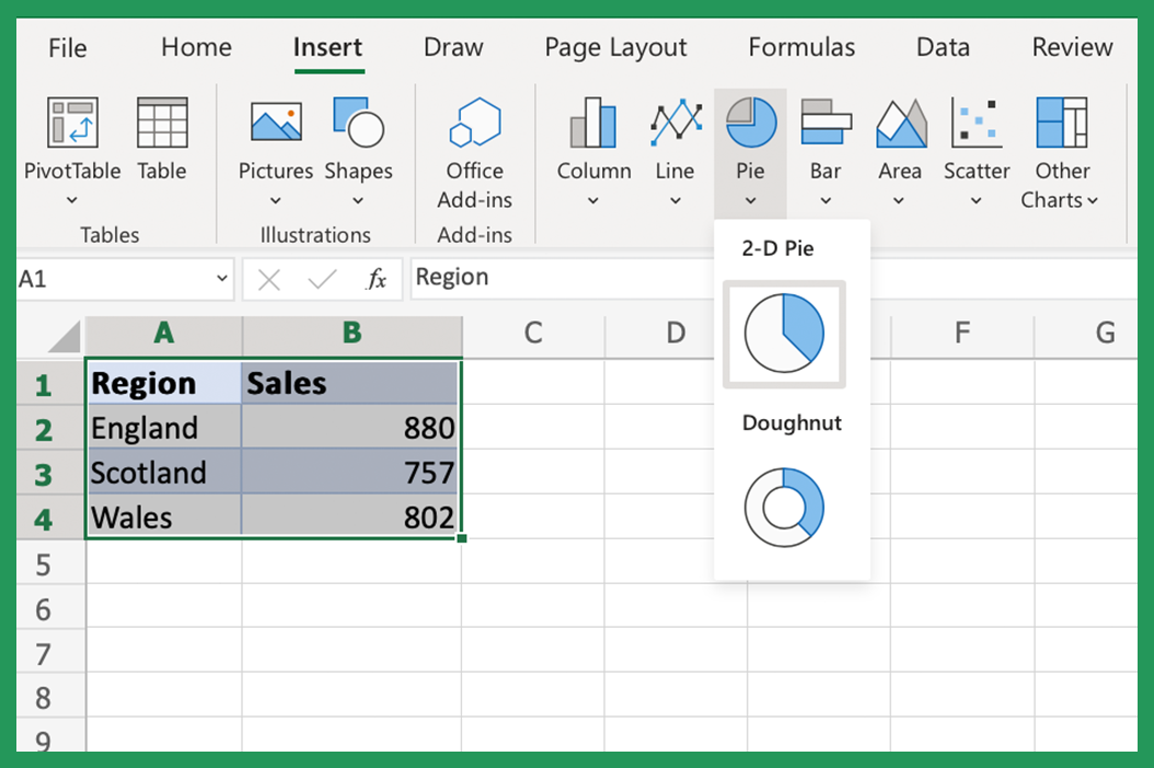
Once you have your data selected in Excel, go to the Insert tab on the ribbon and click the Pie chart button.

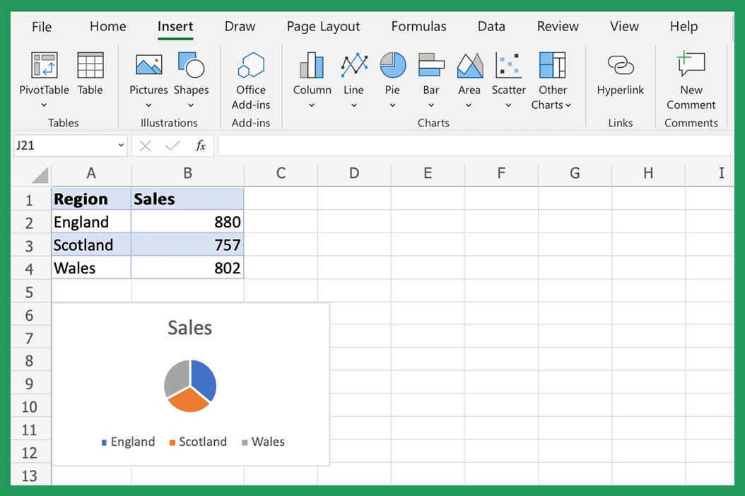
Excel will then create a pie chart based on your data. After you've clicked the Insert tab, you can start to format and customize the chart to suit your needs. For example, you can add labels to the pie chart slices or change the colors of the segments. We will cover some of these formatting options in more detail later on.
Tips for Formatting Pie Charts in Excel
Once you have created your pie chart, it's time to start thinking about how you can adjust it. Here are a few tips to keep in mind:
- Use contrasting colors for the segments - This will help make each slice easier to identify - one slice at a time!
- Keep the number of segments to a minimum - Too many segments can make a pie chart difficult to read.
- Use labels - Pie chart formats are more understandable when labels are used to identify the different segments.
- Add a Format legend - A Format legend can be used to provide additional information about the data in the pie chart.
These are just a few Excel tips to keep in mind when formatting your pie chart. Experiment with different options and adjust based on what works best for your data and your audience.
Exploding Pies and Slices in Excel
One formatting option that you may want to consider is exploding the pie or individual pie chart slices. This can be useful if you want to emphasize a particular segment of the data. To explode a pie or slice, select it and then click on the explode button that appears.
You can also choose to explode multiple pies or slices at the same time by selecting them and then clicking the explode button.
Additional Formatting Options in Excel
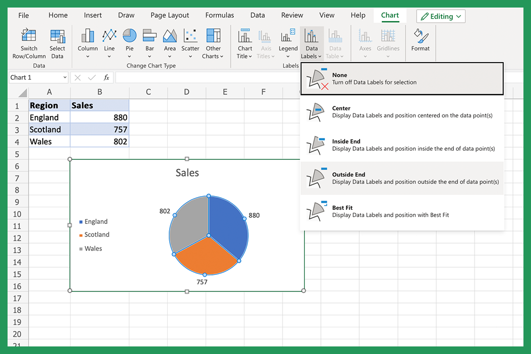
Once you have your pie chart looking the way you want, there are a few additional formatting options that you may want to consider. For example, you can change the position of the legend or add data labels to the pie chart slices.
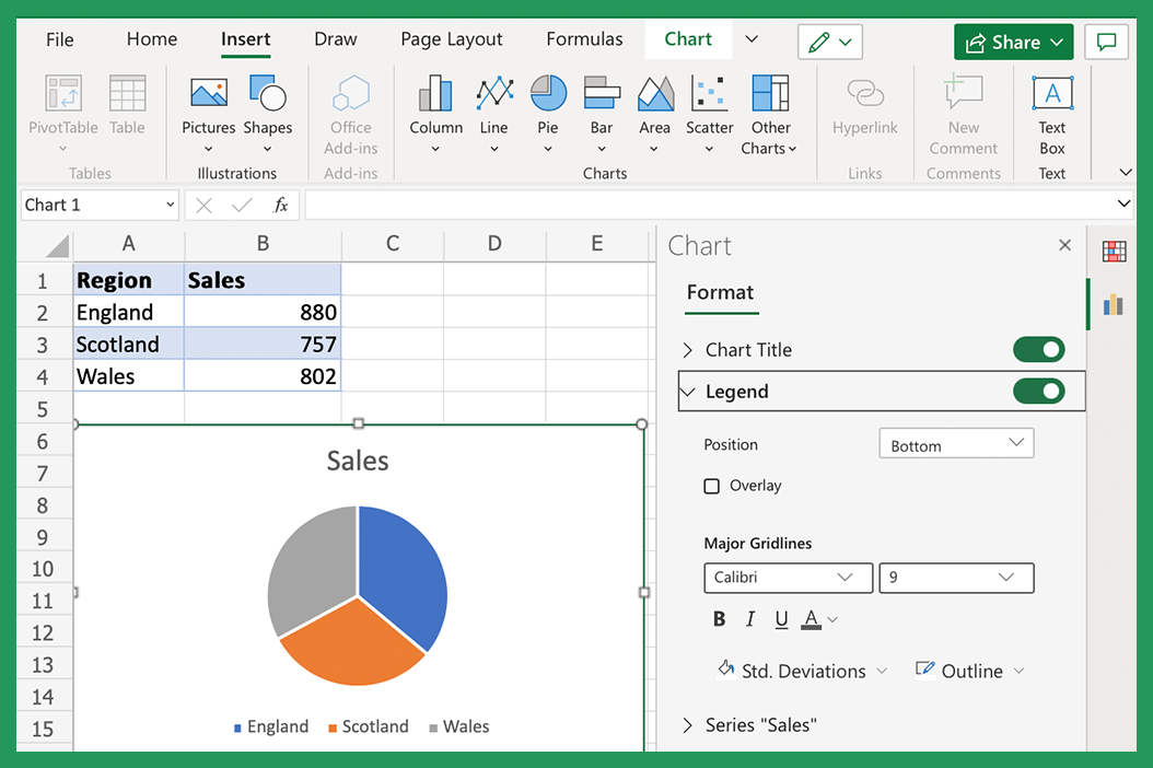
To change the position of the legend, click on it and then use the arrow keys to move it to where you want it. To add data labels, select the pie chart and then go to the ribbon and click on the Add Data Labels button. This will add labels for each slice that show the value of that same data.
How to Read a Pie Chart in Excel
Next, let's look at how to read pie charts in Excel. In order to understand a pie chart, it is important to be familiar with the different parts of the chart. The following terms are often used when referring to pie charts:
- Pie: This is the entire chart.
- Segment: This represents one category of data.
- Slice: This is a portion of the pie that corresponds to a particular value.
- Legend: This provides information about the data in the pie chart.
By understanding these terms, you can better interpret and understand pie charts with Excel.
Examples of Pie Chart Uses in Excel
Now that you know how to create and read pie charts let's take a look at some examples of where they can be used. Pie charts are often used to visualize data such as sales by region or market share by product type. They can also be used to show proportions, such as the percentage of people who responded positively to a survey question.
Pie charts are also sometimes used to compare values, such as the number of males and females in a population. However, it is important to note that Excel pie charts are not the best option for comparing values. A bar chart or column chart will be a better option if you want to compare values.
Quick Pie Chart Elements: Layouts, Styles, and Themes
Once you have the Pie Chart add-in installed within Excel, you can quickly create a pie chart by selecting the data that you want to use and then clicking on the Pie Chart button and then play around with the chart elements. This will open up a menu with different options for creating and formatting your pie chart. You can choose from a variety of chart elements such as layouts, styles, and themes to create a pie chart that looks great.
Pie Chart Layouts in Excel
The Pie Chart add-in comes with a variety of different layouts that you can use to create your pie chart. First, you need to select the new data that you want to use and then click on the Pie Chart button. A menu with different options for creating and formatting your pie chart will then appear. Under the Layout section in Excel, you will see a preview of each layout. Select the layout you want to use and then click on the Apply button.
Pie Chart Styles in Excel
The Pie Chart add-in also comes with different styles that you can use to create your pie chart. Simply select the data set that you want to use and then click on the Pie Chart button. This will open up a menu with various options for creating and formatting your chart. Under the Styles section, you will see a preview of each style. Select the style that you'd like to use and then click on the Apply button.
Pie Chart Themes in Excel
The Pie Chart add-in has different themes that you can use to make your pie chart. Firstly, select the original data that you want to use and then click on the Pie Chart button. This will then open up a menu with more options. Under the Themes section, you will see a preview of each theme. Then, all you need to do is select the theme that you want to use and then click on the Apply button.
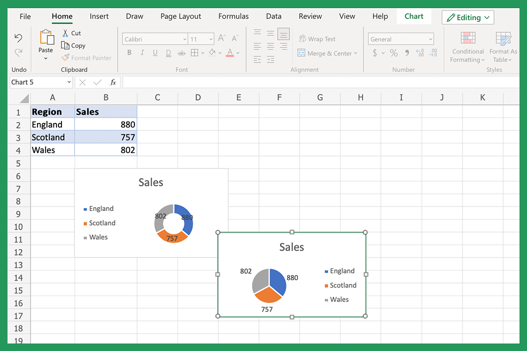
How to Add Labels to a Pie Chart in Excel
Adding labels to a pie chart is a great way to provide additional information about the data in the chart. To add click format data labels, select the pie chart and then go to the ribbon and click on the Add Data Labels button. This will add data labels for each pie chart slice that show the value of that data.
How you can Change the Appearance of a Pie Chart in Excel
Changing Colors, Fonts, and Backgrounds Using Format Data Point
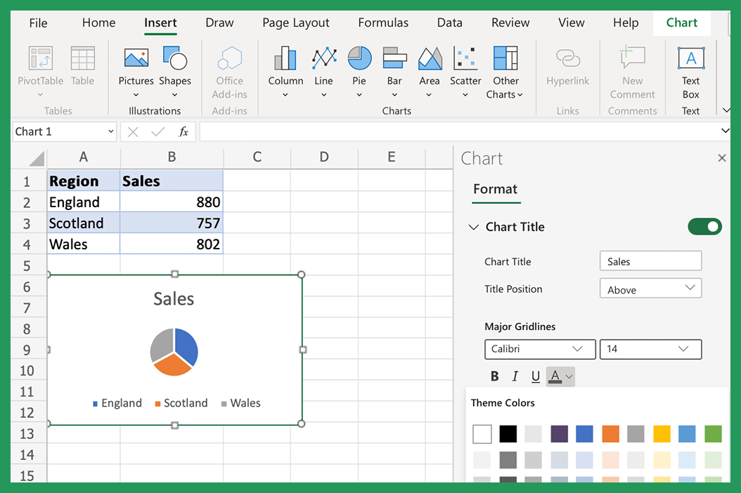
To change the Colors, Fonts, and Backgrounds of a pie slice, click on the slice and then go to the ribbon and click on the Format chart area button. This will open up a Format Data Point window with different options for formatting your pie chart. In addition, you can change the chart color, font color, font size, chart title, and background of a pie slice by selecting the options under the Pie Slice section.
How to Move a Pie Chart in Excel
Excel offers a simple solution if you want to move your pie chart to a different location on your existing sheet. Just click on it and then use the arrow keys to move it exactly where you want it. You can also use the mouse to drag and drop the pie chart into place.
How to Resize a Pie Chart in Excel
To resize a pie chart, click on it and then drag the corner of the chart to make it larger or smaller. You can also use the ribbon to resize any charts. To do this, you need to select the pie chart and click on the Size button to go to the ribbon. This will open up a menu with different size options.
How to Rotate a Pie Chart in Excel
If you want to rotate your pie chart, you need to click pie and then use the arrow keys to rotate it to the desired position. You can also use the mouse to drag and drop pie charts into place.
Using Pie Chart Legends Chart Elements
Legends are optional chart elements within a pie chart that provide information about the data in the chart. To add a legend, you can select the pie chart and then go to the ribbon and click on the Add Legend button. Note, this will add a legend to the circle chart that shows information about each slice.
Creating Exploding Pies and Exploding Slices
An exploding pie is a pie chart with one or more pie slices separated from the rest of the pie. Note that this is typically done to highlight a particular data point. To make an exploding pie, select the pie chart and then go to the ribbon and click on the Format button. This will open up a menu with different options for formatting your pie chart. Under the Series Options section, you will see an option for the Explosion highlight feature. Simply enter a value between 0 and 100 to make an exploding pie.
Using Doughnut Charts
A doughnut chart is actually very similar to a pie chart, but it has a hole in the center. Doughnut charts tend to have more than one format data series, while regular pie charts only use a single format data series. The following process can be used to create a doughnut chart.
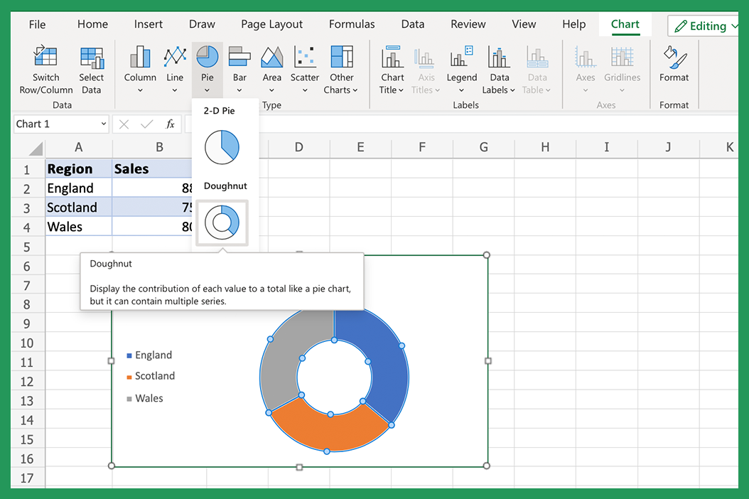
To make a doughnut chart, select the pie chart and then go to the ribbon and click on the Format button. This will open up a menu with different options for formatting your pie chart. For example, under the Series Options section, you will see an option for Doughnut Hole Size. Enter a value between 0 and 100 to create a doughnut chart.
Pie or doughnut charts are a great way to visualize data. However, it is important to use each chart and data series correctly to avoid confusion. Pie charts are best used for comparing values, such as the number of males and females in a population.
Should I Use Pie or Doughnut Chart Styles?
Pie charts are best used for comparing values, such as the number of males and females in a population. Doughnut charts are best used for displaying data that has parts that make up a whole, such as the different chart types of expenses in a budget. When creating a pie or doughnut chart type, it is important to use the correct main chart type to avoid confusing the observer. The only difference you should really be aware of between the different charts is the gap in the middle!
3D Pie Chart Styles
Pie charts can also be displayed in three dimensions. To create a three-dimensional pie chart, select the pie chart type and then go to the ribbon and click on the Format button. This will open up a menu with different options for formatting your pie chart. As mentioned previously, Under the Series Options section, you will see an option for Pie Height. Enter a value between 0 and 100 to create a three-dimensional pie chart.
The Pie Chart Excel add-in makes it easy to create and format pie charts in Excel. Select the data you want to use and double-click on the Pie Chart button. This will open up a menu with different options for creating and formatting your pie chart.
Create Pie Chart: Excel Tips for Newbies
If you're new to Microsoft Excel, the many customization and data options available can feel overwhelming when trying to make a pie chart. Here are some newbie-friendly tips when incorporating immediate analysis pie charts into your Excel spreadsheets:
- For your first pie chart, start with a basic chart. You can always add more complexity later.
- Use a contrasting color scheme for each slice of your pie chart, so they're easy to distinguish.
- If you have a lot of data, don't try to cram it all into one pie chart. Instead, break it up into at least two pie charts.
- Use the format data labels option and legends to explain what your pie chart is showing.
- Pie charts are circular chart options best used for comparing parts of a whole. If you're trying to compare values, use a bar chart or column chart instead.
Do you have any tips for creating pie charts group in Excel? Please share them with us!
Conclusion
We hope this pie charts guide has been helpful in teaching you how to make a perfect pie chart and interpret pie charts in Excel. If you have any questions or require further services, please feel free to leave a message via our contact us page. Thanks for reading!